Visualizing a distribution mapping
WarpX provides via reduced diagnostics an output LoadBalanceCosts, which allows for visualization of a simulation’s distribution mapping and computational costs. Here we demonstrate the workflow for generating this data and using it to plot distribution mappings and load balance costs.
Generating the data
To generate ‘Load Balance Costs’ reduced diagnostics output, WarpX should be run with the following lines added to the input file (the name of the reduced diagnostics file, LBC, and interval in steps to output reduced diagnostics data, 100, may be changed as needed):
warpx.reduced_diags_names = LBC
LBC.type = LoadBalanceCosts
LBC.intervals = 100
The line warpx.reduced_diags_names = LBC sets the name of the reduced diagnostics output file to LBC. The next line LBC.type = LoadBalanceCosts tells WarpX that the reduced diagnostics is a LoadBalanceCosts diagnostic, and instructs WarpX to record costs and rank layouts. The final line, LBC.intervals = 100, controls the interval for output of this reduced diagnostic’s data.
Loading and plotting the data
After generating data (called LBC_knapsack.txt and LBC_sfc.txt in the example
below), the following Python code, along with a helper class in
plot_distribution_mapping.py
can be used to read the data:
# Math
import numpy as np
import random

# Plotting
import matplotlib.pyplot as plt
import matplotlib as mpl
from matplotlib.colors import ListedColormap
from mpl_toolkits.axes_grid1 import make_axes_locatable

# Data handling
import plot_distribution_mapping as pdm

sim_knapsack = pdm.SimData('LBC_knapsack.txt', # Data directory
                           [2800],             # Files to process
                           is_3D=False         # if this is a 2D sim
                          )
sim_sfc = pdm.SimData('LBC_sfc.txt', [2800])

# Set reduced diagnostics data for step 2800
for sim in [sim_knapsack, sim_sfc]: sim(2800)
For 2D data, the following function can be used for visualization of distribution mappings:
# Plotting -- we know beforehand the data is 2D
def plot(sim):
    """
    Plot MPI rank layout for a set of `LoadBalanceCosts` reduced diagnostics
    (2D) data.

    Arguments:
    sim -- SimData class with data (2D) loaded for desired iteration
    """
    # Make first cmap
    cmap = plt.cm.nipy_spectral
    cmaplist = [cmap(i) for i in range(cmap.N)][::-1]
    unique_ranks = np.unique(sim.rank_arr)
    sz = len(unique_ranks)
    cmap = mpl.colors.LinearSegmentedColormap.from_list(
        'my_cmap', cmaplist, sz) # create the new map

    # Make cmap from 1 --> 96 then randomize
    cmaplist= [cmap(i) for i in range(sz)]
    random.Random(6).shuffle(cmaplist)
    cmap = mpl.colors.LinearSegmentedColormap.from_list(
        'my_cmap', cmaplist, sz) # create the new map

    # Define the bins and normalize
    bounds = np.linspace(0, sz, sz + 1)
    norm = mpl.colors.BoundaryNorm(bounds, sz)

    my, mx = sim.rank_arr.shape
    xcoord, ycoord = np.linspace(0,mx,mx+1), np.linspace(0,my,my+1)
    im = plt.pcolormesh(xcoord, ycoord, sim.rank_arr,
                        cmap=cmap, norm=norm)

    # Grid lines
    plt.ylabel('$j$')
    plt.xlabel('$i$')
    plt.minorticks_on()
    plt.hlines(ycoord, xcoord[0], xcoord[-1],
               alpha=0.7, linewidth=0.3, color='lightgrey')
    plt.vlines(xcoord, ycoord[0], ycoord[-1],
               alpha=0.7, linewidth=0.3, color='lightgrey')

    plt.gca().set_aspect('equal')

    # Center rank label
    for j in range(my):
        for i in range(mx):
            text = plt.gca().text(i+0.5, j+0.5, int(sim.rank_arr[j][i]),
                                  ha="center", va="center",
                                  color="w", fontsize=8)

    # Colorbar
    divider = make_axes_locatable(plt.gca())
    cax = divider.new_horizontal(size="5%", pad=0.05)
    plt.gcf().add_axes(cax)
    cb=plt.gcf().colorbar(im, label='rank', cax=cax, orientation="vertical")
    minorticks = np.linspace(0, 1, len(unique_ranks) + 1)
    cb.ax.yaxis.set_ticks(minorticks, minor=True)
The function can be used as follows:
fig, axs = plt.subplots(1, 2, figsize=(12, 6))
plt.sca(axs[0])
plt.title('Knapsack')
plot(sim_knapsack)
plt.sca(axs[1])
plt.title('SFC')
plot(sim_sfc)
plt.tight_layout()
This generates plots like in [fig:knapsack_sfc_distribution_mapping_2D]:
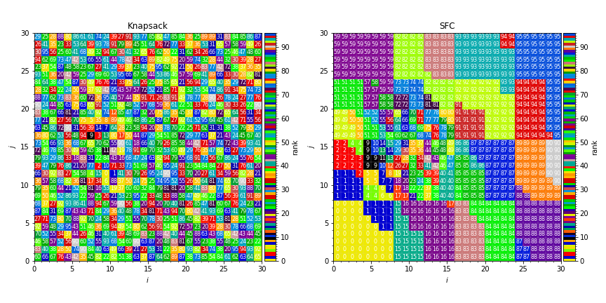
Fig. 2 Sample distribution mappings from simulations with knapsack (left) and space-filling curve (right) policies for update of the distribution mapping when load balancing.
Similarly, the computational costs per box can be plotted with the following code:
fig, axs = plt.subplots(1, 2, figsize=(12, 6))
plt.sca(axs[0])
plt.title('Knapsack')
plt.pcolormesh(sim_knapsack.cost_arr)
plt.sca(axs[1])
plt.title('SFC')
plt.pcolormesh(sim_sfc.cost_arr)

for ax in axs:
    plt.sca(ax)
    plt.ylabel('$j$')
    plt.xlabel('$i$')
    ax.set_aspect('equal')

plt.tight_layout()
This generates plots like in [fig:knapsack_sfc_costs_2D]:
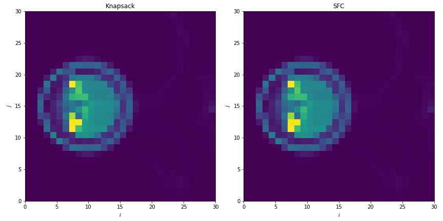
Fig. 3 Sample computational cost per box from simulations with knapsack (left) and space-filling curve (right) policies for update of the distribution mapping when load balancing.
Loading 3D data works the same as loading 2D data, but this time the cost and rank arrays will be 3 dimensional. Here we load and plot some example 3D data (LBC_3D.txt) from a simulation run on 4 MPI ranks. Particles fill the box from \(k=0\) to \(k=1\).
sim_3D = pdm.SimData('LBC_3D.txt', [1,2,3])
sim_3D(1)

# Plotting -- we know beforehand the data is 3D
def plot_3D(sim, j0):
    """
    Plot MPI rank layout for a set of `LoadBalanceCosts` reduced diagnostics
    (3D) data.

    Arguments:
    sim -- SimData class with data (3D) loaded for desired iteration
    j0 -- slice along j direction to plot ik slice
    """
    # Make first cmap
    cmap = plt.cm.viridis
    cmaplist = [cmap(i) for i in range(cmap.N)][::-1]
    unique_ranks = np.unique(sim.rank_arr)
    sz = len(unique_ranks)
    cmap = mpl.colors.LinearSegmentedColormap.from_list(
        'my_cmap', cmaplist, sz) # create the new map

    # Make cmap from 1 --> 96 then randomize
    cmaplist= [cmap(i) for i in range(sz)]
    random.Random(6).shuffle(cmaplist)
    cmap = mpl.colors.LinearSegmentedColormap.from_list(
        'my_cmap', cmaplist, sz) # create the new map

    # Define the bins and normalize
    bounds = np.linspace(0, sz, sz + 1)
    norm = mpl.colors.BoundaryNorm(bounds, sz)

    mz, my, mx = sim.rank_arr.shape
    xcoord, ycoord, zcoord = np.linspace(0,mx,mx+1), np.linspace(0,my,my+1),
                                                     np.linspace(0,mz,mz+1)
    im = plt.pcolormesh(xcoord, zcoord, sim.rank_arr[:,j0,:],
                        cmap=cmap, norm=norm)

    # Grid lines
    plt.ylabel('$k$')
    plt.xlabel('$i$')
    plt.minorticks_on()
    plt.hlines(zcoord, xcoord[0], xcoord[-1],
               alpha=0.7, linewidth=0.3, color='lightgrey')
    plt.vlines(xcoord, zcoord[0], zcoord[-1],
               alpha=0.7, linewidth=0.3, color='lightgrey')

    plt.gca().set_aspect('equal')

    # Center rank label
    for k in range(mz):
        for i in range(mx):
            text = plt.gca().text(i+0.5, k+0.5, int(sim.rank_arr[k][j0][i]),
                                  ha="center", va="center",
                                  color="red", fontsize=8)

    # Colorbar
    divider = make_axes_locatable(plt.gca())
    cax = divider.new_horizontal(size="5%", pad=0.05)
    plt.gcf().add_axes(cax)
    cb=plt.gcf().colorbar(im, label='rank', cax=cax, orientation="vertical")
    ticks = np.linspace(0, 1, len(unique_ranks)+1)
    cb.ax.yaxis.set_ticks(ticks)
    cb.ax.yaxis.set_ticklabels([0, 1, 2, 3, " "])

fig, axs = plt.subplots(2, 2, figsize=(8, 8))
for j,ax in enumerate(axs.flatten()):
    plt.sca(ax)
    plt.title('j={}'.format(j))
    plot_3D(sim_3D, j)
    plt.tight_layout()
This generates plots like in [fig:distribution_mapping_3D]:
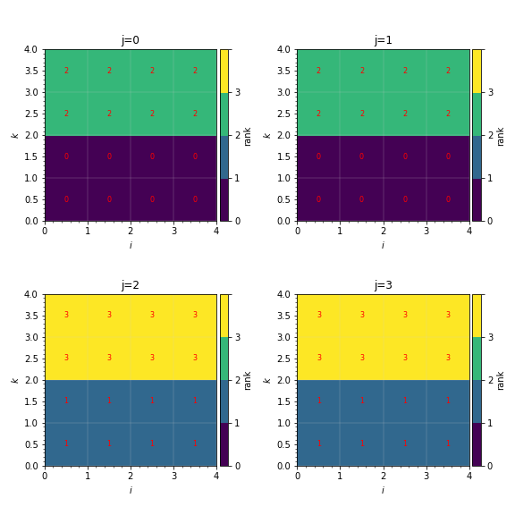
Fig. 4 Sample distribution mappings from 3D simulations, visualized as slices in the \(ik\) plane along \(j\).